Ashin Posted June 13, 2005 Report Share Posted June 13, 2005 I can't see the skull. =( Quote Link to comment Share on other sites More sharing options...
Zyco Posted June 13, 2005 Report Share Posted June 13, 2005 I see the Quebec Nordiques logo upside down I think it looks great tho, I think the colors can be tweaked more tho.. I like the font of the South of Heaven text Quote Link to comment Share on other sites More sharing options...
Guest Posted June 13, 2005 Report Share Posted June 13, 2005 I like this a lot except for the colors. The colors of the first logo were better and I liked the background. Quote Link to comment Share on other sites More sharing options...
pyroglyphix Posted June 13, 2005 Author Report Share Posted June 13, 2005 I agree, it's not...striking enough, or something. So I reworked it a bit, I also wanted to fit the "heaven" aspect into it somewhere: Quote Link to comment Share on other sites More sharing options...
Ashin Posted June 13, 2005 Report Share Posted June 13, 2005 OK now on that one the flur thingie and the moth look very interesting to my eye. I see what you wanted to do with the ring, but with those colors it winds up feeling a bit trite (think: life preserver) to me. Thank you for all the effort you keep putting in Glyff. =) As you recall, it took weeks for us to agree to a name, so I don't expect this decision to wrap up in a day or two either. =P Have you thought about omitting the ring entirely? Honestly I think that the flur/moth thing is interesting enough on its own so that it does not require the ring. Perhaps go back to your first approach of having a background image that the whole thing rests on; that might be more sophisticated. Quote Link to comment Share on other sites More sharing options...
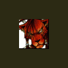
pyroglyphix Posted June 13, 2005 Author Report Share Posted June 13, 2005 How's this taste? Quote Link to comment Share on other sites More sharing options...
Ashin Posted June 14, 2005 Report Share Posted June 14, 2005 With these colors and the lack of a ring, the logo starts to look like a strange ghost/angel figure now, which I find interesting. I'd almost like it if the stars of the background strip were not so clearly visible.. more of just an abstract band of color? I think we are getting really close here. What do you guys think? Quote Link to comment Share on other sites More sharing options...
Skaka Posted June 14, 2005 Report Share Posted June 14, 2005 I definately like the logo the way it is and I agree the stars may stand out a bit to much. One thing I was thinking was possibly stretching out the backround a bit farther and fading it as it goes? To me it looks to small with the guild name and logo. Quote Link to comment Share on other sites More sharing options...
Golgi Posted June 14, 2005 Report Share Posted June 14, 2005 I like it. I kinda see a dragon or something similiar like that. Quote Link to comment Share on other sites More sharing options...
Zyco Posted June 14, 2005 Report Share Posted June 14, 2005 Maybe have that star/background image as the whole forum border? and clip the actual logo part and fit in there? Instead of that white space we see above and that phpbb box there Quote Link to comment Share on other sites More sharing options...

Recommended Posts
Join the conversation
You can post now and register later. If you have an account, sign in now to post with your account.